28 Jul 2013

Why did God create the Earth?

Ok, so it had best be known, in case that is not already quite obvious, that I am not in any way a believer in concepts, things or people (please cross out the terms that are irrelevant to you, as nobody has yet managed to define to which category "God" belongs: possibly "he", "she" or "it" is a category to themselves) that are qualified by some as a deity or deities. 

But I grew up in a culture that did tend to believe in such things, and which maintains the rather strange visual embodiment of this concept as an oldish man with a beard, often to be found lurking behind a cloud, and sometimes preceded by rays of sun slanting down towards this planet to which us humans (at least most of us) are confined.

So all this is to explain why I find this image somewhat familiar and the message funny.


The corollary to which is of course the following question: "do penguins have knees?". And this can lead to other questions of that ilk, such as "and if they do, what do they use them for?"

(With all due thanks to those who introduced me to this image and transferred it to my computer, in particular my niece Arabella and one of her daughters, Marina)


20 Jul 2013

My 16th bike is a modified Suzuki GSXR 1100

You never thought that I would talk about Japanese bikes on this site? Wrong, dead wrong as I am far from sectarian in bike-likes, even though I may have periodic preferences.  Anything with wheels can be fun, and anything with 2 wheels and a motor is usually plenty of fun. I have total respect for any motorbike, even if I would not want to own many of them. Way back in the past I did once own a Honda 175 twin and, for running around streets in London near where I once lived and playing kiddies in paddocks, a 50cc Monkey Bike.

I have admired many Japanese motorcycles and Japan is clearly one of the all-time most creative and prolific producers of bikes. I hold fond memories of watching Mike the Bike howling between the curbs, walls and hedges on the Isle of Man circuit on Honda 6's and 4's. And some legendary machines I would really like to own, like the Honda RW30.

But, amongst the many more accessible, mass-produced machines that have made Japanese motorcycles dominate in just about every category of motorized 2 wheelers, there is one engine and frame that have always appeared to me as a sculptural work of motorcycle art, albeit of the art brut kind: the Suzuki GSXR of the air and oil-cooled era. The rectangular section aluminium frame was quite revolutionary when introduced in about 1984 and these bikes, initially of 750cc before also coming out in a big-bore 1100 cc version, were at the time the fastest on the road and were directly derived from the Suzuki endurance racers that were at that time cleaning up on the circuits.


This Suzuki GSXR 1100 is originally from about 1991 but has now  been considerably modified, freed of all fairings, and is now sitting in my garage.

Not being a purist or a "collector" of original machines that have to have everything in place just as it came out of the crate, I like to see some improvements and/or modifications made to most bikes. This is about two things. Firstly actual improvements and adaptations to one's current usage, since, after all, many items or pieces of technology have improved over that past decades (just think of tyres, to take just one example). But also the idea that a motorbike is such a personal (and, agreed, egotistical) piece of machinery that one may as well go to it and make it more distinctively individual by doing (or, in my case, mostly having done) various modifications for aesthetic and technical reasons. Customizing is the name of that game, I suppose.

A while ago I saw in the excellent French magazine Café Racer (www.cafe-racer.fr) an article on a workshop out in the eastern suburbs of Paris called KMP (and here is their web site, in French:www.kmp.fr‎) which specializes mainly in GSXRs of various eras, and their rebuilding and transformation into customized machines of various types. And the prices they were asking for these renovated and modified machines looked pretty reasonable, given the work that had presumably gone into them. So, after a few months secret longing and some saving-up, I finally took the plunge and went to see them with firmish intentions. Very friendly and informative was Christophe, the boss, and he showed me a bike that I had in fact spotted in the Cafe Racer article. I remembered liking its sober grey livery with a see-through section in the tank to check fuel level, its polished frame and spoked wheels. It still needed a bit of work and I asked for a few other mods also, so I finally got it back home about 6 weeks later.


What's it like to ride? Bit of a pig in traffic, added to which the carburetors need a bit of sorting still as it misfires between 4 and 5,000 rpm, which is just what you don't need when accelerating! The braking is great and it feels like a rail in bends although it is pretty physical to turn. The tiny electronic rev-counter/ digital speedo doesn't work but I'm having that changed for something better and more legible. Not sure I will do 500 kms per day on this but it's a blast to ride. The Hindle silencers say they are homologated, but I'm not sure by whom or for what. Maybe the man was called Hindle Homologated? As it is impossible to see what speed you're actually doing, I tried playing it by ear but soon realized that I had no chance there as I am far too used to singles or twins that rev much lower. Instead I constantly find myself feeling for higher gears that seem to be missing from the gearbox. I suppose I will get used to this motor running at way above 8,000 rpm or whatever.

The bike is currently back with KMP for the necessary adjustments. Will tell you more soon. I suspect it has been overbored to about 1240cc. She looks the part anyway, so I am pleased with my piece of sculpture. Can my driver's licence resist though?


Ride well and safely.

18 Jul 2013

What can one tell of a wine from wrapping?


The packaging of all kinds of produce has been used for as long as anyone can remember to make them more attractive to potential buyers, and wine is clearly no exception. Paradoxically, people are in theory quite suspicious of appearances, whilst regularly falling for seductive trappings. Popular sayings in different languages clearly express the idea that packaging bears little or no relation to what is to be found inside. For example : « you can’t  judge a book by looking at the cover », or the French equivalent « l’habit ne fait pas le moine », meaning « you cannot tell a monk by his dress ». But packaging is clearly important and indeed useful to help distinguish one product from another and to situate it somewhere on an aesthetic or economical scale of values, even when these codes are more or less ignored or transgressed by the producer, knowingly or otherwise.


Sparkling Champagne, in particular, was an innovative and expensive type of wine to produce, back in in the 19th century when industrial bottles and machine labeling began to be part of the regular process for packaging wines. To help justify the prices asked and to project an image of luxury and wealth that satisfied the egos of consumers as well as the pockets of producers and retailers, labeling of sparkling wines from the Champagne region got very fancy, as some of the examples above clearly show. It is worth noting that the Champagne region had not yet been delimitated, and even less become an Appellation Contrôlée at this time. Interesting also to note that individual Champagne villages were then considered to be significant, and in fact more so than the term Champagne itself, which had not yet become the significant regional collective brand that was later to be developed.

I have often been struck by the fact that few of my wine journalist colleagues seem to talk much about wine labels or packaging in general. Is this because they consider the subject unworthy of attention, or does it mean that they do not like judging books by covers, with which I tend to agree anyway ? But the subject merits our attention nonetheless, and I personally enjoy many of the efforts of graphic designers and other creative artisans to make the bottles we gaze at on shelves fall into our hands. Our dominant sense is clearly the visual one, so we may as well admit it. Ask any shop manager in the wine section of a self-service outlet, and they will surely tell you that pricing and packaging play the main part in decision-making on the part of the majority of wine buyers whom, it should be underlined, are NOT regular readers of wine blogs, web sites or magazines devoted to what they simply consider (and perhaps rightly) as just another drink.


The appearance of a bottle definitely makes a statement about the producer and the product. Just take a look at any of those created by (or for) Randall Grahm in California to get the point. A couple are shown above. Naturally this kind of label is speaking to a bunch of initiates, who have some access to the words and thought process of someone as sophisticated, witty and creative as Grahm.

It can of course be argued that the best ( ?) and longest-known wines hardly need sophisticated packaging to sell themselves, since they have already found an audience who is often prepared to pay totally absurd sums of money just to possess one such bottle and for whom the label, apart from the prestige it reflects on the owner of that bottle amongst his friends or business relations, is secondary at best. But what about all those other wines, which probably constitute about 99% of the world vinous lake?


Let’s take a look at the more-or-less entry level in price terms. All kinds of ideas have been tried to make wines more accessible to a wider public, and one can but approve of these attempts. One of the latest to come on the market (although I had previously spotted this idea in use for a Provençal wine being sold in Thailand about 15 years ago) is wine in aluminium cans. These small cans (187 milliliters, or the equivalent of a quarter bottle) retail in France for 2,50 euros and have recently been launched by a company called Winestar. Don’t like the name much, but that’s not the point perhaps. I received three of the wines (as shown above) from this new company. A white, a rosé and a red. All were from the vast and usually inexpensive Languedoc region of southern France, and indeed from appellations contrôlées within that. Now I realize that the idea of wine in cans will induce a grimace on the part of many wine buffs, but I say why not? If this convenient manner of carrying and consuming induces large numbers of younger people to the joys of wine, then let’s hope the idea takes off in a big way. It is surely better for them than the sugar-infested mixed alcohol beverages that many consume at the moment.  And it may lead to a greater degree of sophistication and interest in drinks with some refinement of flavour, rather then just alcohol and sugar. One can always dream I suppose. Anyway I decided to taste these three wines from a company that claims to be the Nespresso of wine. Now that's quite a claim since the Nespresso product is of superior quality in its flavours. To be honest, I did not find this to be the case with Winestar, as you will see.  Of course, when one knows that a wine has been served from a can, the natural tendency is to think that it has a metallic flavour, and this happened to me with 2 out of the 3 samples I had. I will have to repeat the test, with other similar wines and with the wines poured into a glass by someone in another room. But, for what they is worth, here are my tasting notes.

Winestar, Corbières blanc 2011
A clean rather soft nose that shows aromas of yellow fruit. Ok on the palate, although it seems a bit firm, more chemical than fruity. Has some body to it but this doesn’t quite hide what I construed, perhaps wrongly, as a mineral and metallic texture.
Winestar, Languedoc rosé 2012
This has pleasant fruit flavours of the grenache/cinsault type.Quite precisely defined and lively on the palate, with persistence of this pleasant fruit character. I still found that it had a lightly metallic finish.
Winestar, Corbières rouge 2011
The nose is oaky and smoky – a bit too much so in fact. This is rustic in texture, and even a bit rough. It is an honest but unrefined wine of the type that one finds very often in this area, although the bad ones are getting thankfully fewer by the year. At least it didn’t seem metallic to me! Next time we’ll do this blind and see whether the metallic feel was a figment of my imagination and prejudice.


Another recent opportunity to test relationships between packaging and wines was given to me by a friend who imports wines from various countries, mostly far away, to France. He was looking at some samples of possible additions to his already extensive range and asked me, as he often does, to give my opinion on them and their value for money.
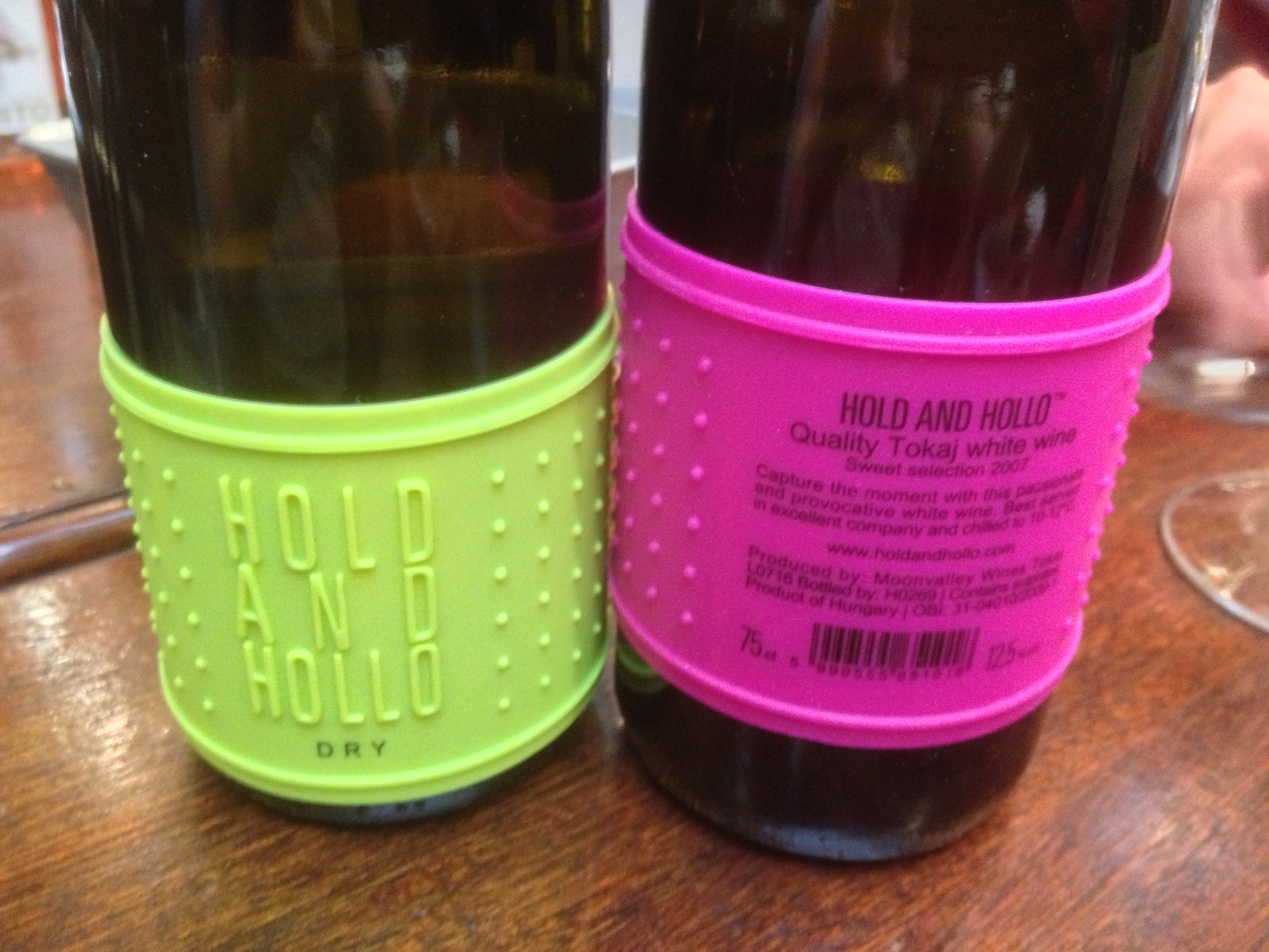
First up were this pair that hail, unexpectedly, from Hungary and the somewhat tradition-bound region of Tokay, best known for its very sweet (and often magnificent) Aszu wines. This pair comprised a dry white and a sweet white, but not an Aszu. Now Hold and Hollo is a pretty strange name for a wine brand and I’m not quite sure that I get it all. I think I grasped the « Hold » part (ha!ha!) as the pimples on the plastic wrap that doubles as a label makes it far easier to grab the bottle out of an ice bucket. But « Hollo » ? Another surprise was the price. Visual creativity is good and I have no objection to these examples, but somehow they convey to me an image of a fairly inexpensive wine, perhaps in the realm of 10 euros or even less. But in fact they would have to retail for at least double that sum. Therein lies, I think, a discrepancy between the target/image and the price. What about the wines? The dry white was excellent, vibrant, firmly structured and lingering. The sweet was a bit ordinary and lacking in zip. So, what else?


These two wines, which hail from the Yarra Valley in Victoria, Australia, seemed to me to have it all. Refinement of textures and flavours (at least the Chardonnay and the Pinot noir, pictured here), creative and easy to read labels, an arresting brand name, Innocent Bystander , and screwcaps to keep the goods in, the air out, and the wine free of unwanted contamination. To add to which, I thought that the back labels, which are too often wasted on a load of guff about brilliant « terroir » and imagined flavours, not to mention trite food pairings, were well and concisely put, saying just enough about the winemaking approach and the place of origin to intrigue one without telling the potential consumer what he or she should be tasting in their glass (see below).


I saw a photo of the winery, which seems as elegantly modern as the packaging of these wines, and which also incorporates a good restaurant. This producer seems to have worked out a fully coherent ensemble in which all the parts link well to the others and the whole is harmonious. Congratulations! 

Another example for the road, with a different story but a similar approach in which aesthetics of some boldness tell a dramatic story. I have a friend, called Raimond de Villeneuve, whose vineyard in Provence was totally devastated by a hailstorm on July 7th last year. Raimond works hard to make ends meet and has made a slot for himself due to the excellence of his wines and a good dose of creativity.  Château de Roquefort is the name of the estate and its winery is far from the latest in high-tech as Raimond is not rich. He has just managed to keep together a family estate, or what is left of it, by hard work and talent. In a few minutes last July he saw everything on the floor, the 24 hectares of vines stripped of leaves and, of course, fruit. Later, after calling a few vigneron friends, the idea emerged amongst them to give Raimond small plots of vineyards here and there to harvest so that he could at least produce some wine and survive. The numbers grew to about 20, including many of the most reputed estates in Provence and the Southern Rhône Valley.


The result, or at least one of them since he also made a couple of other wines thanks to this solidarity operation, is shown above. It is called Red no 2, Grêle 2012 (grêle being French for hail). It cannot bear the name of his estate as the grapes did not come from there. And it is a Vin de la Méditerranée, a vast area covering a lot of South-Eastern France. Indeed the grapes came from estates that are up to 200 kilometers apart. And the wine? Bloody good. Very easy drinking, with lots of lively mediterranean character. An exemplary and flavour-packed « quaffing » wine that has emerged from an exemplary story that shows that some people are, well, good. And the packaging? Raimond’s graphic design has been handled for some time by a friend of his from Austria (or is it Germany ?). Anyway, I feel that this label succeeds brilliantly in conveying both the violence of the original catastrophe, and the subtle blend of all the estate names that slip into the picture like so many autographs on a rugby shirt, forming a sense of team spirit that has been his saviour.

So yes, labels can tell a story, or at least symbolize one or part of one. But you probably need the keys to the full story behind the scenes to make all the connections. The rest is about aesthetics,....just like one's taste for a wine in fact.

13 Jul 2013

André Brink and The Rights of Desire

The Rights of Desire is the first book that I have read by the South-African author, André Brink. I have been reading it, off and on, for some weeks now, interspersed with other readings, and have just finished it in a French translation.


Given the contents of this book, I would say that the title seems just a little curious, or rather slightly off the mark, despite the fact that desire (in this case of an older man for a young woman) is very much a part, and indeed one of the main themes of the book. Yet I am not sure that this theme is the central one. The narrator, himself a writer now aged over 60 and living alone, becomes obssessed with a young and slightly unpredictable woman for whom he provides a room in his large and now empty house (his wife is dead and his sons are grown-up and living elsewhere). And much of what happens to him afterwards results more or less from this obsession. But not only, as the theme of contemporary violence in South Africa is perhaps even more central to the way the book develops. My nit-picking with the title is perhaps more about the term "rights". Desire can provide no "rights" over the person desired, and this is clearly born out in the book. So why did Brink choose this title, rather than, say, "The results of desire" or "The powers of desire"? Or indeed something completely different. We will perhaps never know.


Unlike his compatriot Coetzee, about whom I wrote recently on this blog in connection with his published correspondence with Paul Auster, Brink has remained in South Africa where he lives and teaches in Capetown, and has also retained strong links with his mother tongue, Afrikaans. Indeed Brink, along with other authors like Breytenbach, worked within this language to speak out against Apartheid, and one of his novels (Looking into Darkness) was the first to be banned by the Afrikaaner government during this period.

Brink speaks very clearly about the violence that is sadly so much a part of contemporary South African life. Between the gated and guarded houses in Johannisburg and its rampant criminality to the apparently more tranquil Capetown, he makes it clear that there is just as much violence in and around Capetown. Robbery, rape and murder seem to walk the streets and parks, but Brink is not out here for sensationalism: he is an honest observer and weaves these into his story as facts of life that are linked, in all probability, to the dramatic history of the country and to the huge economic disparities that he also mentions as shocking. Personal or not (and surely all novels contain a complex mixture of the personal and the invented), the story he recounts in The Rights of Desire seems to draw on much of his own experience, as a writer, teacher and observer. His own close family has been victim to extreme forms of violence. Corruption among civil servants and incapacity (and/or complicity) of the police are also denounced, and so Brink, having totally opposed Apertheid, remains equally lucid as to the downside of contemporary South Africa, whilst seeming, through his main character, still very reluctant to leave, "because he is here".

Other important characters are a ghost (who is so revealing of the horrific violence and injustices of the past) and Magrieta, the narrator's imposing and incredibly wise housekeeper who has suffered more than her fair share of violence too, but who remains steadfast and philosophical until (almost) the end of the book.

On the desire aspect of title, the ageing narrator's desire for the younger woman, Tessa, is described both openly and subtly. She is young (about 30), free and beautiful, but also lost and given to mythomania. Ruben, the retired teacher and writer, is refined and complexed, but is also able, in his lucid moments, to face the facts of the situation, without being at any time able to fully understand the object of his love. His behaviour towards Tessa oscillates to the rhythm of the ambiguity of the situation: he acts at times like a father towards her, at others like a jealous and rejected lover.They also have a friendship, of sorts, depite the destruction that she causes in his life. In a way, the best title might have been "The destructions of desire".   

I may well read more of Brink's work


Read on....


8 Jul 2013

International rugby : the lion roars, finally

The British (and Irish) Lions Rugby Union tour of a southern hemisphere country takes place every 4 years and constitutes the only occasion for the four nations that make up the British Isles (England, Wales, Scotland and Ireland) to play rugby together against a common opponent. Usually they are opposed to one another, and annually so in the (now) 6 nations tournament, which has seen the successive addditions to the elite European rugby-playing nations' club of France (1910 to 1931 and then again after the second world war) and finally of Italy in 2000, since the British Isles countries first started playing rugby against each other in 1882.


It is perhaps one of rugby's most striking and endearing features that enemies on the field of what is, after all, a fairly violent combat sport, can become friends off the field, and even join forces to defeat a common opponent. The Lions is the name given to this shared team that only exists every 4 years, and so is necessarily short of the shared reflexes and experience that is one of the ingredients of a successful rugby team. We should remember that, however much individual brilliance is necessary and admirable on  a rugby field, it is above all a very collective sport, in which discipline, solidarity and anticipation of what another player is about to do are all-important.


The 2013 Lions team have just defeated Australia, in Australia and in a three match series, narrowly winning their first test match 23-21, narrowly losing the second one 15-16, and comprehensively winning the third and decisive game, played in Sydney on July 6th in front of a crowd of some 83,000 spectators, by a resounding 41-16. As many commentators have underlined, this is the first Lions series victory since the team of that time, under the captaincy of Martin Johnson, defeated South Africa (2 games to 1) in 1997.

Mike Philips, the Welsh scrum-half, congratulates Alex Corbisiero, the English prop forward, on the latter's try in the opening minutes of the 3rd test. So the Welsh don't always deem the English to be their worst enemies after all!

So what are, or have been in this instance, the key factors in making this tour a sporting success for the Lions? One has to start with the cohesion somehow found between the top players who, for the most part, had little or no experience of playing together before this tour and its fairly short period of preparation. Which preparation was truncated even further by a cascade of injuries to key playrs during the intital phases, and causing changes in captaincies as well as in key positions. But in fact this handicap factor was intelligently reduced by the head coach, the New-Zealander Warren Gatland, by his selection of a majority of Welsh players (10 out of 15 for the opening team in the final game) in his squad. Why so many Welsh players ? Two reasons: one, the Welsh have regularly been the best European team over the past few years, and, two, Gatland has been their coach so they know each other well. Naturally this has annoyed commentators from the other three countries involved, but it has to be said that he has proved his point by the results, and particularly the very convincing domination handed out by the Lions team in the 3rd game.


Warren Gatland (foreground), the British Lions coach is congratulated by Robbie Deans, the coach of the Australian team, after the last game in the series.  It should be noted that both coaches are from New Zealand, rugby's undisputed top nation. Also that Robbie Deans has already been fired by the Australian rugby board, paying the price for this defeat.


Amongst the handicaps that were overcome by this mixed team has been a string of injuries to key players. Paul O'connell, the Irish lock forward in the first test, Warburton the Welsh flanker and captain in the second test, and so on. Jamie Roberts, the powerhouse Welsh centre back who missed the first 2 tests, and so on. And the coach added his own share of controversial surprises, particularly that of dropping Brian O'Driscoll, the Irish star player, for the third and decisive game, preferring the Welsh pair of Davies and Roberts in the centre slots of the backs. 

The two Welsh captains, Sam Warburton (left) and Alun Wynn Jones, with the trophy after Saturday's game


Other explanatory factors? Well the old adage that says "no scrum no win" was totally validated in this third test match. The Wallabies were comprehensively dominated in this key sector of the game, the French referee awarding penalty after penalty to the Lions on account of the Australians' repeated failures to resist in the scrums. And at least one of the 4 tries scored by the British team resulted directly from a scrum. Given that southern hemisphere nations tend to place less emphasis on this aspect of the game, and hence their referees to be less attentive to the rules that govern it, one could imagine that the first two tests, which were refereed by men from New Zealand and South Africa, could have had a somewhat different configuration had they been refereed by the Frenchman, Romain Poite, but of course that is pure speculation. So my choice for the star players could well be shared by all the Lions' scrum members.

One picture cannot tell the tale of an 80 minute-long battle, but this collapsed scrum is a symbol of the Wallabies' defeat in the third test.

In a collective game such as rugby, I am always reticent to single out individual players, but several stood out, for their spectacular and decisive actions at key moments in the games, or for their regularity in their respective positions and roles. And my man of the series would have to be the diminutive (it is untrue to say that all rugby players are now giants) Welsh full-back, Leigh Halfpenny. With his extremely precise goal kicking from all parts of the field (I believe that he finished the tour with a success rate in the region of 90%), he scored 49 points in the three tests and 21 alone in the final one. One could add "no kick, no win" to the scrum adage. The Australians lost the first test essentially because their best goal kicker was injured in the opening minutes of the game, and one of the reasons for their narrow victory in the second game was his return. But Halfpenny was also decisive in his field play, making two of the Lions's tries in the third test. He proved his worth equally by good positioning, defeating opponents ball in hand, and making the right pass at the right moment. 


Lions' full-back Leigh Halfpenny kicks for goal, with impressive statistics of a 90% success rate on the tour


For Australia, the revelation of the series has to be the very tall, strong and surprisingly  nimble winger, Israel Folau, who went over twice in the first test (see first photo below). He was regularly impressive ball in hand, despite the moment when his vis-à-vis, the equally huge Welsh winger, George North, picked the big man up and carried him a few yards on his shoulder following a tackle (second photo below). 


Given that North also scored key tries (1st and 3rd tests), he also figures as one of the "stars" of the Lions team, regularly focusing much attention on the part of defenders and hence creating gaps for his colleagues, even when he himself was unable to break through the usually hermetic Australian defense.


North scoring his try in the first test. He flew over with another one that was rightly  not allowed for a foot in touch just before


 Daniel Craig with the Irish fly-half Jonathan Sexton after the final victory. So James Bond did it again? And where was Moneypenny?

What else? Well, apart from some excellent rugby and two very tense games that could have gone either way, we saw movie stars enjoing the final game and an amazing 30 to 40 thousand Lions supporters making the long trip down under at huge cost to themselves and making the whole thing look like a giant party (which it surely wasn't on the field!)


It can  look likewarfare on the field, but rugby fans, unlike many of their soccer counterparts, have a good time together (and long may this spirit reign!). The beer bills must have been remarkable too.